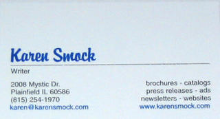
I haven't actually given it to anyone yet, but I'm working on it. The background is white - it just looks odd in the photo. I know the script font is a little wacky, but the selection at Staples is limited to the first fonts ever created. One day maybe I can have a snazzy logo. For now, this is better than scribbling my info on post-its. I've had worse-looking cards in my career.
So far, today has been a good day. I got to speak to an actual person in an actual marketing department instead of being dumped into voice mail or HR. While he didn't need any freelancers right now, he liked the fact that I am nearby and have relevant industry experience and said to send him my information. It might go straight in the garbage, but it's the best response I've had so far, so I'm clinging to it. Plus, I'll be able to send a snazzy card :)
On the book front, I spent 4 hours at the library yesterday, making my way through the list of "to fix" items I made last week. I can actually see some progress. Now I just need to type it up and add it to the official page count.
I like my cards.


3 comments:
That looks like the Brush Script MT font, only more upright.
/showing off my mad font skillz
Cool beans! You are off and running now. I keep forgetting to ask someone in the design side about contracting.
Glad you didn't fall into full freakout mode.
Mystic Drive sounds mysterious, but shouldn't you use a real street name?
Memory Lane. This might be good too for the work you plan on doing.
Post a Comment